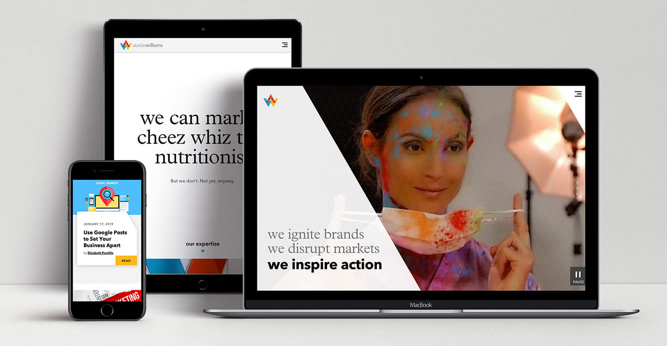
We design and launch a lot of websites for clients. Each one is filled with enhanced user functionality, a renewed sense of purpose and mission and lots of eye candy.
So when it came time to design and launch our own new home on the internet, we had to think big.
“This is the most obvious representation of our new brand and is likely the first thing people see when they hear about us, so it needed to convey the excitement and energy of who we are,” said Eva LaMere, president of Austin Williams. “They say you get one chance to make a first impression. We wanted to knock people over.”
“The site definitely had to have a wow factor to show off our chops,” said Frank Durante, director of digital development. “But more than that, it needed to deliver the content visitors wanted to see—how they want to see it. Like all our sites, a great user experience (UX) is paramount. We wanted to make the site big and bold (like our new brand) and be incredibly easy to use. I think we achieved that.”
That combination of standout creativity and a clear path forward starts to shine immediately, right from the home page, where Durante says the AW team had to go back to school, to use math skills that would make the angled visuals window—a nod to the new AW brand—open and close properly.
“You don’t notice it, but that angle hits a different point at the top of your browser window depending on the size of the window,” he says. “We actually used the Pythagorean theorem—something taught in high school math classes—to make it function properly.”
But a flashy home page was just the start: Durante says the new site is based on a deep dive into the analytics of the old Austin Williams website. By determining which pages were most popular, designers built a site map that focused on those pages, then created a UX that would provide the best user journey to that information.
When it came to the creative design of the website, Durante says Jody Bonaventura-Fisher, senior art director, dove in with both feet, creating stunning ways to present everything from case studies to agency expertise and services.
“We pulled inspiration from lots of different types of websites to give us a new perspective on how to present our own strengths,” says Bonaventura-Fisher. “We looked at sites in the automotive and fashion industries, especially. There are some really beautiful and creative things going on out there.”
From there, Bonaventura-Fisher says, she went down a “rabbit hole” of design options, tinkering (almost endlessly) with different suggestions for sets of pages. How did she settle on the right ones? “Deadlines help,” she admits.
Her favorite parts of the website, she says, are the parts that fly under the radar. “We added interesting hover states and interactive elements to enhance the user’s journey,” said Bonaventura-Fisher. “We also structured the case studies in more of an editorial fashion to help tell a story.” (See the Higher Education, Financial Services, Healthcare and Professional Services logos on the Services page)
Bonaventura-Fisher was also the creative force behind identifying “flixels” to present our team members on the People page. Each image in the gallery is animated, to “show a glimpse of each of us: our characteristics, quirks, interests, passions and humor,” says Durante.
Aside from the creative and analytic aspects, Durante is also quick to point out that the new site complies with the Americans with Disabilities Act (ADA) standards. “We promote it to our clients as something they need to do, so we felt we needed to also.” (For a look at what goes into ADA compliant websites, read our article, Making Your Website ADA Compliant: This Won’t Hurt a Bit.)
And now that it’s live?
“Just before we launched, it kind of felt like one of those cooking shows with the timer counting down,” says Durante. “Now that it’s live, I get to put my knives down and stand back and watch people taste it.”


