Hudson Valley Federal Credit Union
one more reason people are banking and borrowing here
overview
Over the course of 20 years, Hudson Valley Federal Credit Union (HVFCU) had grown into a $4.7-billion financial institution in Upstate New York; their brand identity, however, remained the same. The research-driven rebranding strategy we developed helped to change all that, giving consumers and businesses a reason to take a closer look at—and switch to—HVFCU. And switch they did: The credit union posted annual deposit and loan increases that consistently beat industry averages throughout the campaign’s multi-year run.
Brand Development
Standing out against some stiff competition
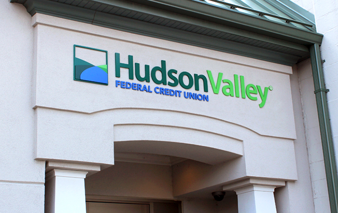
Modern yet warm, friendly, and distinctly community-focused, the HVFCU brand distinguished the credit union from their “big bank” competitors, and clearly communicates who they are—and who they serve.


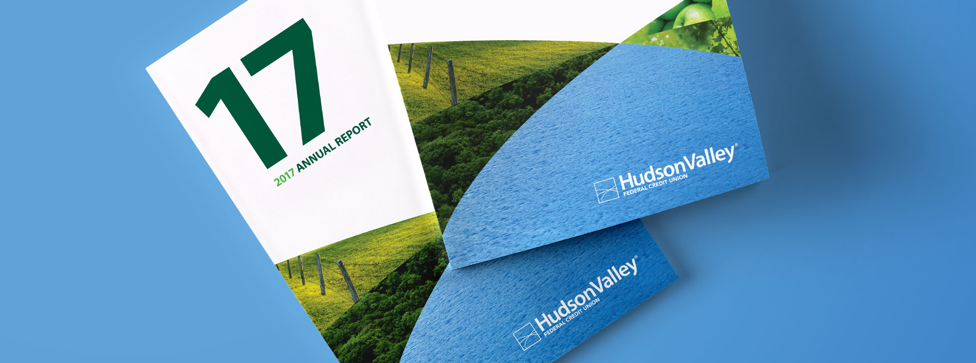
The Valley icon is integral to all HVFCU-branded communications, from paid media placements to annual reports and collateral.

Video & Motion
Piquing interest—and awareness—in The Valley…
The research results made it clear: HVFCU is perceived as the local financial partner that puts the needs of their members and community first. Our initial broadcast creative leverages The Valley name to bring that position to life.
This new series takes the creative from “to life” to “real life,” incorporating the reasons real members bank or borrow with HVFCU in an innovative take on the tried-and-true testimonials.
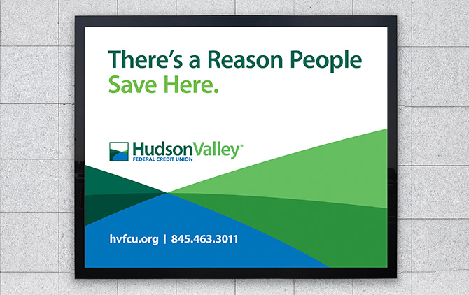
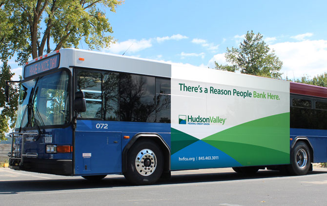
Out-of-Home
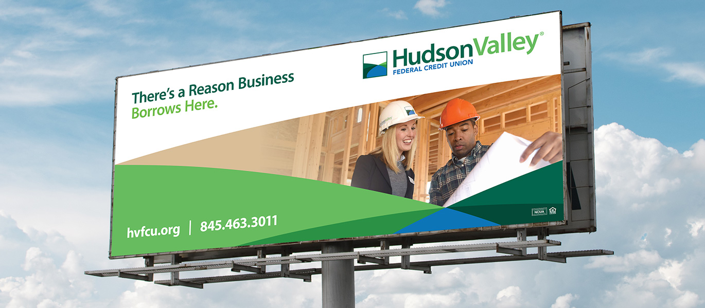
… and around The Valley
DIGITAL
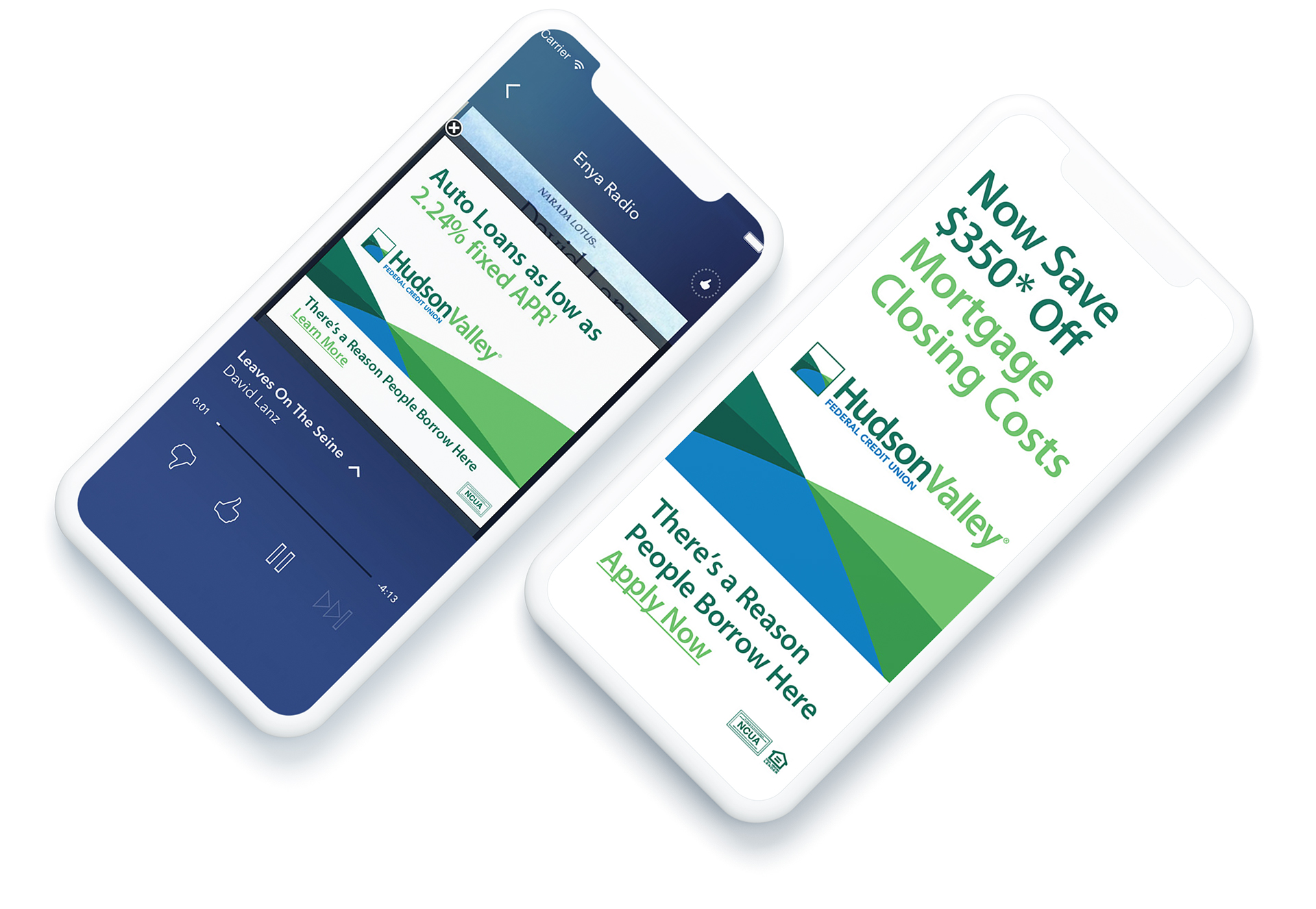
Promoting products, driving sales
With broadcast and out-of-home building awareness, product-focused digital executions (as well as print) drove account openings.
Outcomes
12.2%
increase in loans
8.5%
increase in deposits
7K
net member growth


