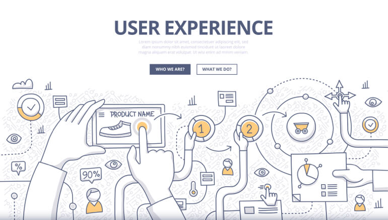
The end of the year is quickly barreling down on us, making it a great time to take a quick look back at 2017’s top five trends in web user experience (UX) design—and what we can learn from them.
Scrolling versus Navigation
When you think of a basic website, you usually envision a series of pages, each being an individual bit of information. But with more people viewing websites on their phone, traveling to multiple pages makes a site less of a convenience and more of a chore (particularly if it’s one with a slower load time). This is why it is better to have a single page to scroll through to get information. The era of “below the fold” development is quickly dwindling away.
Sticky Call-to-Action Buttons
Your website is more than just a repository of information; it has a goal. You want visitors to contact you, buy your product, or sign up for your most recent seminar. That is why your call-to-action button should always be visible and available because you never know when you’ve sold a client, and you never want to lose that conversion because the “next step” button is out of reach.
Persuader Videos
Videos are a great way to simultaneously describe your product or service while engaging visitors. Now, it’s time to make it personal. Recent studies show that when comparing videos with animation and those with people and testimonials, people and testimonials win every time. The human mind prefers to put a face to a company rather than a disembodied voice.
Anchor Text Visual Cues
Links are the backbone of the entire internet. Without them, our websites would become stagnant. But so many times, a site’s links can appear disinteresting or, worse, indistinguishable from regular text on the page. Giving your links—at the very least, your very important ones—a distinct visual cue will draw the human eye far more than standard in-text ones.
Home Page as a Landing Page
Many times, a website’s home page just relays the most basic of info. With people more willing to scroll for information now (see trend #1), treat your home page as you would a landing page, with all the most pertinent data on it, allowing anyone at a glance to be able to get the info they need.
What do you see as the biggest UX trend of 2017? Or do you have a prediction for what we’ll see in 2018?


