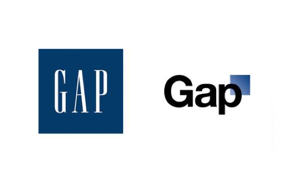
When you’re in advertising or marketing, you often find yourself acting as the “Brand Police” for your clients.
That being said, I would have loved to be a fly on the wall during the conversation between the marketing department at Gap North America and its advertising agency when they decided to change the Gap logo last month.
A few questions come to mind:
- Why would such a strong, well-known and brand-familiar company like Gap embark on such an endeavor without conducting research or getting a temperature read on consumers first?
- Why change?
- Why now?
If it’s not broke, don’t fix it. Case in point: Remember the “New” Coke? An article in Las Cruces Sun-News articulated these same thoughts and asked some of the same questions.
You have to wonder what the motivation was, especially since it all happened so fast—and without any “launch” (atypical in the world of fashion) or fanfare. Gap announced it was changing its logo, used social media and crowdsourcing to engage and measure reaction, then reverted to its original logo just a few days later after an avalanche of negative feedback.
Could this marketing faux pas have been a publicity stunt just in time for your holiday shopping?
Who knows what the future holds for Gap’s logo (in existence since 1969).
Weigh in: In with the old and out with the new? What do you think?


